Fill, Gradient, Opacity, Images, Radius, Borders & Shadows
Make things look however you want.
In this lesson, you’ll learn how to control the look and feel of elements in Framer. From background colours to borders, radius, shadows and more, you’ll get familiar with the core visual tools.
🗺️ getting Oriented
This lesson kicks off the styling chapter by helping you master the core visual tools in Framer. You’ll learn how to adjust fills, opacity, image backgrounds, corners, borders, and shadows, and be able to conceptualise how each of these changes affect the feel of your designs.
Learning Outcomes
By the end of this lesson, you’ll be able to:
Apply solid and gradient fills using Framer’s fill tools
Control visibility using both Master and Targeted opacity settings
Add and customise images as backgrounds or frame content
Adjust corner radius and border styles to shape your elements
Apply and layer shadows to create visual depth and emphasis
Contents
Fills, Colours & Gradients 🏋🏻♂️
Playing Around with Opacity 🏋🏻♂️
Adding Images 🏋🏻♂️
Exploring Radius 🏋🏻♂️
Setting Borders 🏋🏻♂️
Applying Shadows to Things 🏋🏻♂️
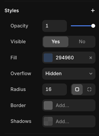
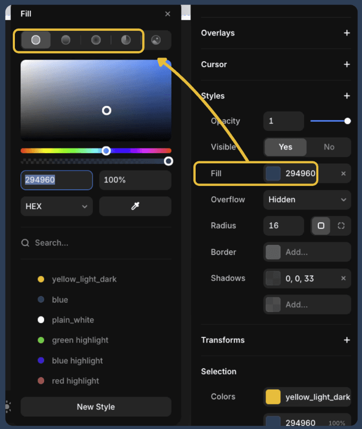
Updating Fills Colours & Gradients
In this section, we're going to explore some of the standard 'Fill' Settings you can play with, including standard fills and gradients.
🏋🏻♂️ Exercise
The diagram below shows how to bring up the fill settings for any given object.
In the section underneath this, change the colours of the objects 'Change This' so that they match/are very similar to the objects in the 'To This' column.
Change this
To This
Opacity
Let's experiment with making objects transparent.
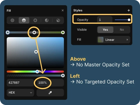
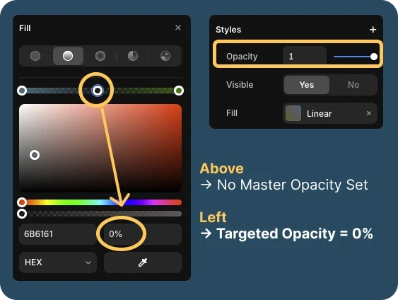
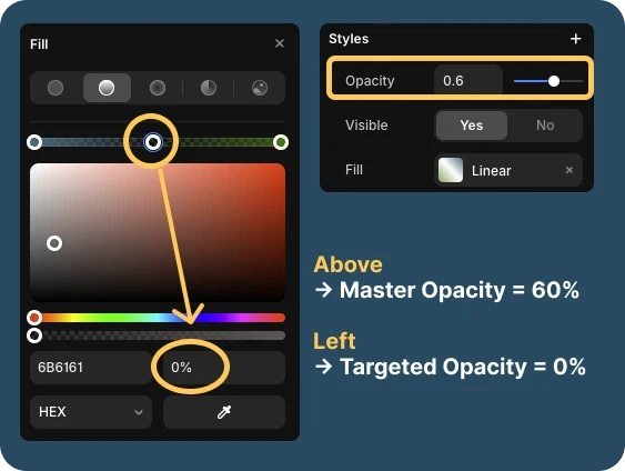
Master vs Targeted Opacity
Opacity is typically configured in two separate places, allowing for Master or Targeted control.
⚠️ Important! Pay attention to the way the text colour changes. What does it tell you about the ways Targeted vs Master opacity impact child elements?
No Opacity Set
Master Opacity Set
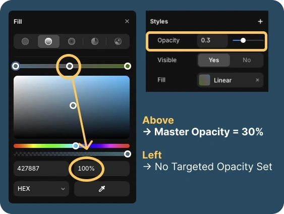
Master Opacity Set
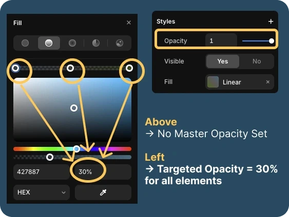
Targeted Opacity Set
Master and Targeted Opacity Set
🏋🏻♂️ Exercise! Let's play around with Opacity
Try to rebuild the card on the right
Remember: You can also apply opacity settings to Text!
Change this
To This
Lorem ipsum Dolor
Lorem ipsum Dolor
Images
Let's experiment with making objects transparent.
How to get images into Figma
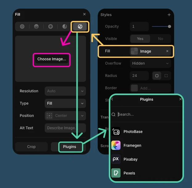
Option 1: Apply them as Frame Backgrounds
Select or create a frame you want to add an image to
Select Fill > Image button. From here, you can choose whether you want to
Upload an image from your computer, or;
Instantly apply one from one of the many, handy stock image plugins
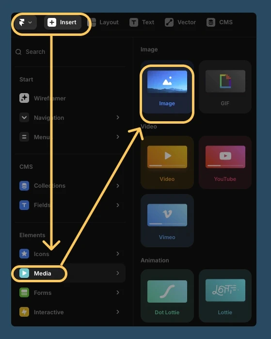
Option 2: Via the Insert Menu
Navigate to Insert > Media > Image and drag it into theframe
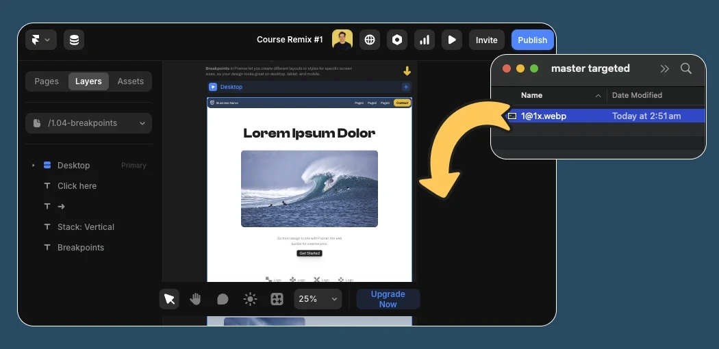
Option 3: Just drag it onto the canvas from your computer.
Pretty straightforward really!
🏋🏻♂️ Exercise! Let's Add some images
We'll explore how to customise image styles in a later lesson. For now, let's just practice getting them into the frames!
Radius
Let's play around with transforming frames into custom shapes.
Different Radius types
More often than not, you'll want to give equal radius to all edges of a shape.
However frequently, you'll need to get more specific, and specify radius for individual edges of a frame.
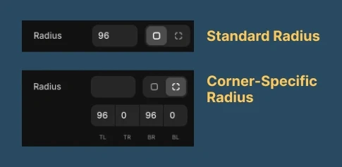
🏋🏻♂️ Exercise! Let's explore radius
Change this
To This


Borders
Let's play around with giving objects prettier borders
Different Radius types
More often than not, you'll want to give equal radius to all edges of a shape.
However frequently, you'll need to get more specific, and specify radius for individual edges of a frame.
🏋🏻♂️ Exercise! Let's tinker around setting borders
Change this
To This

Shadows
Give your designs a bit of extra depth and make things POP!
Getting Oriented
More often than not, you'll want to give equal radius to all edges of a shape.
However frequently, you'll need to get more specific, and specify radius for individual edges of a frame.
🏋🏻♂️ Exercise! Let's practice applying shadows to things
Change this
To This
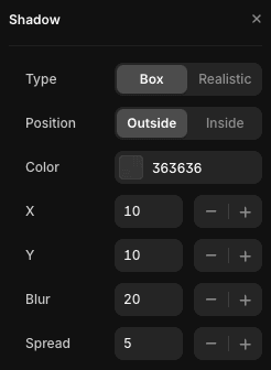
External
Shadow (Box)
External
Shadow (Realistic)
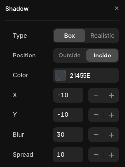
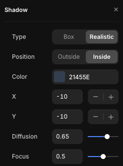
Internal
Shadow (Box)
Internal
Shadow (Realistic)
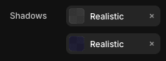
I've got an internal AND external shadow (Realistic)
I've got a border (yellow) & Hard External Box Shadow (black)
Glossary of Shadow terms & Key Concepts
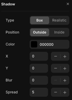
General Levers
Color and Opacity: You will want to get comfortable changing the opacity of the color to make the shadow more/less obvious.
X = How far to the right the shadow will span. (-X values = left)
Y = how far down below the shadow will go (-Y values for up)
Box Shadows
Blur controls how soft or sharp the shadow looks. Higher values make it more feathered.
Spread expands or shrinks the size of the shadow. Positive values grow it, negative values pull it in.
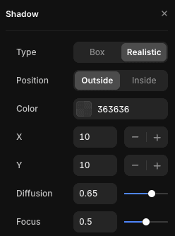
'Realistic' Shadows
Clicking 'Realistic shadows' can save you time configuring a 'box' shadow so that it looks natural. They're designed to mimic how light behaves in real life.
Diffusion controls how wide and soft the shadow appears—the higher the value, the more it spreads out.
Focus how sharp or blurry the shadow edge is—lower values make it softer, higher values make it crisper..
Stacking shadows on shadows
Shadows help users understand depth, hierarchy, and interactivity by visually separating elements and guiding attention.
You can apply multiple shadow layers, including internal and external shadows, to make elements feel more 3D and engaging.
Stacking shadows on borders
You can also use shadows as a second border by setting the X and Y offsets to 0, using a solid color (like black at 100% opacity), and adjusting the spread.
In the example shown, the shadow doesn’t cast away—it hugs the element evenly, creating a clean outline effect.