This is an H1 Title. There can ONLY be one of these on each page!
This page will walk you through the main accessibility tags used in web design—like headings h1… h6 and paragraphs etc. You'll also learn the basics of text properties in Framer, so your pages are clear, readable, and follow best practices.

Important lesson! Search engines give extra weight to the first 100 words on any webpage. Use this space to clearly explain your content and include the keywords you want to rank for. This helps Google understand your page and improves your chances of appearing in search results.

Section Eyebrow
This is an H2. Each section should start with an H2.
I'm a section intro. I'm written in standard body text. At a high level, 100–300 words per section is optimal for engagement.
H2: Intro to Heading Structures
I'm another section intro. Also written in standard body paragraph (p) text, as standard. Notice how this text is spread out across the page? Means the reader has to literally move their neck to read it. This is bad for the User experience.
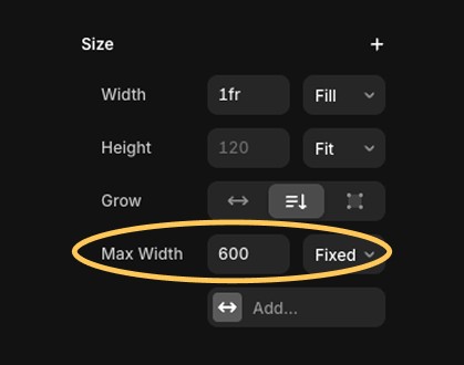
Generally speaking, it's better to limit the size of a text element to a narrower paragraph width for readability. Personally, I like to give my paragraphs a max width of 600px-800px depending on the text size (see image below)
I'm an H3. You'll find one or more of me me nested under H2s
Keep paragraphs short, but maybe not this short. You'll want to target 2–4 lines max for each one.
H3: Important lesson on heading tag hierarchy and ordering
Make sure you only ever use headings in ORDER! Proper heading hierarchy helps search engines and screen readers understand the content structure. Don’t skip levels (e.g. going from H1 to H4). It’s good for SEO and accessibility.
H4: Make sure that the order only ever looks something like this:
H4: Never nest an H4 immediately under an H2 without an H3 in-between.
I'm an H3 and there's quite a bit of content nested under me! When/how should you break the content up?
H4: When you’re introducing multiple ideas or benefits
H4: When the text exceeds ~500–600 words
H4: When it’s hard to understand the section at a glance
H4: When there's no clear visual hierarchy (e.g. no subheadings or dividers)
H4: Some Common things you can do to break up content
H5: Use subheadings
H5: Use bullet point lists
H5: Use images

H3: This hierarchy and structure is a universal standard!
Headings follow a universal structure used not just in web design. Tools like Microsoft Word and Google Docs also rely on you using Headings to streamline document navigation, build outlines and insert tables of contents.
If you use proper heading tags when drafting, you can copy and paste directly into most website builders, and your content will automatically adapt to the the predefined formatting and styles.
Here's another H2 for you, because this is a brand new section.
Just reinforcing that you shouldn't ever have two H2s in a given section!

This is an H3.
The quick brown fox jumped over the lazy dog.

This is also an H3.
Another quick brown fox jumped over the same lazy dog.

Yep, another h3 here.
The same quick brown fox jumped over a different lazy dog.
H2: How to control/update the tag of any text item manually in Framer.
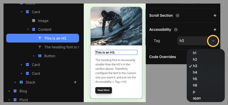
Sometimes, you’ll want a piece of text—like an eyebrow label or a visually customised heading—to look different from your standard styles, but still be recognised by Google as a proper heading.
In these cases, you can set the visual style manually, while still assigning it a semantic heading tag (like h2 or h3) in the Accessibility panel.
H3: Different Tags and their use cases
- h1: The main page title – use only once per page
- h2: Section headings – each major section should start with an H2
- h3–h6: Subheadings under H2s (use to break down content hierarchically)
- p: Standard paragraph text - use this for body text
- span: Inline text with no semantic meaning – use only when you don’t want the text to act like a heading or paragraph. This is very useful for eyebrow text and breadcrumbs!
H2: A typical Web Page will use TWO Typefaces (aka fonts).
Fonts play a big role in how your website feels and how easy it is to read. Most websites use two fonts:
One for headings (to catch attention)
One for body text (to keep things clear and readable)
Your font choices are a big part of your brand, just like your colors and logo.
H3: Intro to fontpairings
H4: General Guidelines for Headings
Headings are where you can add a bit of personality. You might choose a bold or stylised font here to make a strong first impression.
H4: General Guidelines for body paragraphs
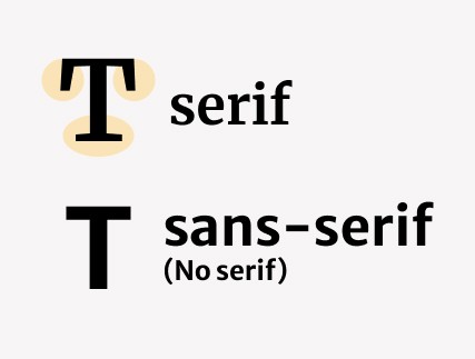
For body text, it’s best to stick with a sans-serif font (like Inter, Roboto, or Helvetica).
Sans-serif fonts are cleaner and easier to read—especially on screens and at smaller sizes.
H4: Where to look for font-pairing inspiration
If you're looking for inspiration on which fontpairs you should consider, check out the font pairings on offer at Fontpair!
H3: You can also install Custom Fonts if you like
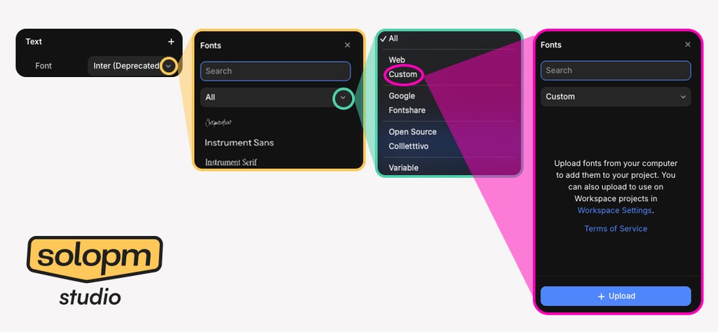
You’re not limited to the default fonts in Framer. If you have a specific font in mind, you can upload it directly to your project.
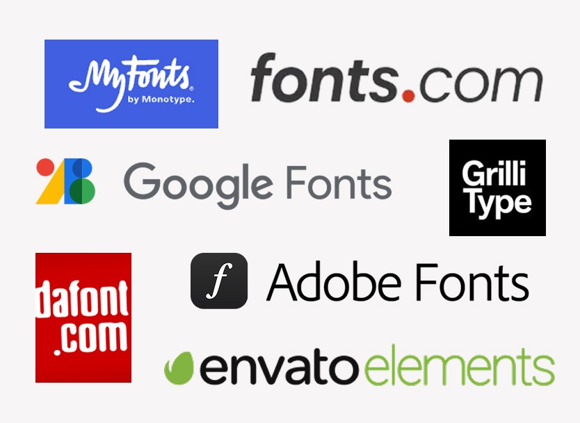
H4: Places to find custom fonts
H4: How to upload a custom font in Framer
H4: Warning - Check the license when you download a font!
H2. General Text Styling
In this guide, I will not take you through all of the standard text formatting options. I'm assuming you're familiar with font weights, italicism, paragraph alignment from using Microsoft Word.
However, I will be taking you through some of the options more specifically important to WEB DESIGN.
H3: Play around with the advanced text settings!
Headings follow a universal structure—used not just in web design, but in tools like Microsoft Word and Google Docs to build outlines and tables of contents.
If you use proper heading tags when drafting, you can copy and paste directly into most website builders, and your content will automatically adapt to the the predefined formatting and styles.
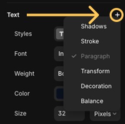
H4: Common use cases
Shadows – Adds a shadow behind your text; useful for contrast or depth.
Stroke – Outlines your text with a colored border; can be used for bold or outlined text effects.
Paragraph – Controls paragraph-level settings like alignment, indentation, and spacing.
Transform – Changes the case of your text (e.g. uppercase, lowercase, capitalize).
Decoration – Adds styling like underline, line-through (strikethrough), or overline.
Balance – Adjusts line breaking for headings to make text look more visually even and balanced.
H2. Text Box Sizing
If you grab any text box on the page, you'll notice there are three 'Grow' shortcuts underneath. Here's what you need to know about them.
To explore what each of them do, grab the H3 text titles on each of the cards, and scale them bigger or smaller. You can do this by selecting the text box, and either dragging the box, or by adding more/less pixels to the text box size in the width/height settings.
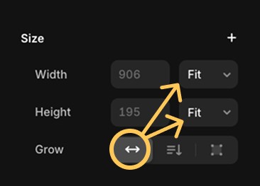
My text box = 'Grow' (Horizontal)
This sets the width and height to fit content.
Key behaviours
As you type, the text box itself will extend to accomodate the extra letters, keeping everything on a single line.
If you manually resize the box, the text size scales with it.
Best for:
Single-line text (e.g. buttons, badges, titles)
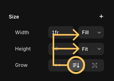
My text box = Auto Height. I will grow vertically the more that's typed into me.
This is probably the most frequently used setting! ✅
This sets the width of the text box to fill the space of the parent container, and the height to fit content.
Key Behaviours
Text wraps onto new lines and the box gets taller as needed
Width stays fixed, keeping layout stable
Best for:
Paragraphs, blog excerpts, or any text that may grow over time
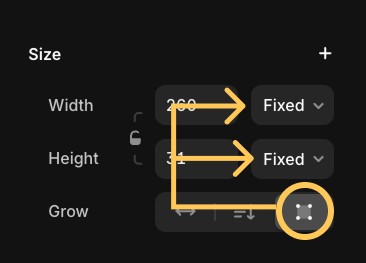
My text box = fixed size. My box size won't change no matter what.
Both width and height are locked. The text doesn’t grow the box—it just wraps or overflows within the set size.
Key Behaviours
Overflow text subject to 'overflow' rules
You can manually style the size without auto adjustments
Best for:
Cards or labels where space is tightly controlled
H2. Text Sizing Options
The first thing to know about font size is that it’s measured in pixels. So if your font size is set to 24, that means each line of text is 24 pixels tall by default.
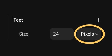
The the text under me is set to size 24 Pixels
The quick brown fox jumped over the lazy dog.
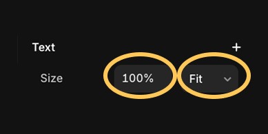
The the text immediately under me is set to size: Fit
H2. Text 'Line' Options (Vertical Spacing)
As covered above, font size equates to font HEIGHT in PIXELS.
Line height (also called line spacing) controls how much vertical space appears between those lines. It affects how readable, airy, or dense your text feels.
In Framer, you can set line height using percent (%), EM, or pixels (px)—each works a little differently and is better suited to different types of layouts.
H3. Percentage '%' Settings
This is probably the most useful and intuitive setting for beginners. ✅✅✅
If your font size is 24px and you set the line height to 150%, each line will sit in a 36px-high row—that’s 24px of text plus 12px of spacing.
Because it’s based on a percentage of the font size, it automatically adjusts when the font size changes, making it great for responsive layouts.

The text underneath has text line set to 100%
The quick brown fox jumped over the lazy dog. It paused for a moment, tail twitching, then darted off into the tall grass. Behind it, the dog let out a sigh and rolled onto its side, unbothered.
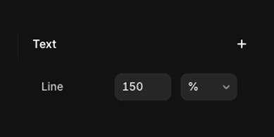
The text underneath has text line set to 150%
The quick brown fox jumped over the lazy dog. It paused for a moment, tail twitching, then darted off into the tall grass. Behind it, the dog let out a sigh and rolled onto its side, unbothered.
H3. EM Settings
This option works almost the same as percentages and is often preferred by developers working with inherited styles in more complex layouts—but it’s just as valid for beginners. ✅✅✅
EM units also scale the line height based on the font size:
1EM = 100%, so a 24px font with 1.5EM line height gives you 36px between lines.
If your font is 36px, 1EM is 36px, and 1.5EM is 54px.
It’s flexible, semantic, and behaves the same way as % in most simple use cases.
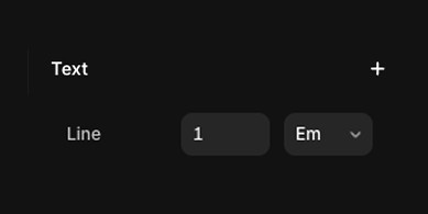
The text underneath has text line set to 1EM
The quick brown fox jumped over the lazy dog. It paused for a moment, tail twitching, then darted off into the tall grass. Behind it, the dog let out a sigh and rolled onto its side, unbothered.

The text underneath has text line set to 1.5EM
The quick brown fox jumped over the lazy dog. It paused for a moment, tail twitching, then darted off into the tall grass. Behind it, the dog let out a sigh and rolled onto its side, unbothered.
H3. 'Pixel' Settings
This setting is not recommended for most situations. ❌❌❌
When you set line height in pixels, it becomes fixed. So, if your font size changes, the spacing won’t update. This means every time you adjust your text size, you’ll need to manually recalculate and change the line height to keep things looking right.
This can easily lead to inconsistent spacing, especially in responsive designs. Use it only when you need very precise control over layout height and don't expect the text size to change.

The text underneath has text line set to 24px
The quick brown fox jumped over the lazy dog. It paused for a moment, tail twitching, then darted off into the tall grass. Behind it, the dog let out a sigh and rolled onto its side, unbothered.
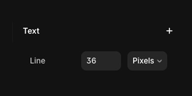
The text underneath has text line set to 36px
The quick brown fox jumped over the lazy dog. It paused for a moment, tail twitching, then darted off into the tall grass. Behind it, the dog let out a sigh and rolled onto its side, unbothered.
H2. Text 'Letter' Options (Horizontal Spacing)
Letter spacing (also called lettering or tracking) controls the space between characters in a text block. It can make your text feel tighter, or more spacious, or more stylised—depending on your goal.
You can set letter spacing using pixels (px) or EM, depending on how precise or scalable you want the effect to be.
H3. 'EM' Settings
EM letter spacing adds proportionate space between each character, based on the font size. ✅✅✅
So, if you change your font size, the horizontal spacing between letters will scales up or down automatically without you needing to do any extra calculations.
For example:
1EMadds space equal to the full width of one character1.5EMadds 1.5x that amount between each letterSo if your font size is 24px, then
1EMgives you 24px of space between letters,and
1.5EMgives you 36px.
This makes EM great for responsive typography, because spacing stays balanced even when font sizes adjust across breakpoints or devices.

The text underneath has text lettering set to 0EM. So, NO PIXELS between characters.
The quick brown fox jumped over the lazy dog. It paused for a moment, tail twitching, then darted off into the tall grass. Behind it, the dog let out a sigh and rolled onto its side, unbothered.
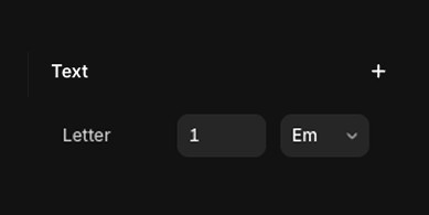
The text underneath has text lettering set to 1 EM. Hence, 24x1=24px between characters.
The quick brown fox jumped over the lazy dog. It paused for a moment, tail twitching, then darted off into the tall grass. Behind it, the dog let out a sigh and rolled onto its side, unbothered.
This is not generally recommended.❌❌❌
Letter spacing in pixels adds or removes a fixed number of pixels between each character.
A negative value (like -2px) pulls characters closer together
A positive value (like 4px) pushes characters further apart
This method gives you exact control, but doesn’t scale with font size—so it’s best used when your text and layout sizes are fixed.
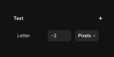
The text underneath has text lettering set to -2 pixels
The quick brown fox jumped over the lazy dog. It paused for a moment, tail twitching, then darted off into the tall grass. Behind it, the dog let out a sigh and rolled onto its side, unbothered.
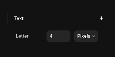
The text underneath has text lettering set to 4 pixels
The quick brown fox jumped over the lazy dog. It paused for a moment, tail twitching, then darted off into the tall grass. Behind it, the dog let out a sigh and rolled onto its side, unbothered.
H2. Paragraph Settings
The first thing to know about font size is that it’s measured in pixels. So if your font size is set to 24, that means each line of text is 24 pixels tall by default.
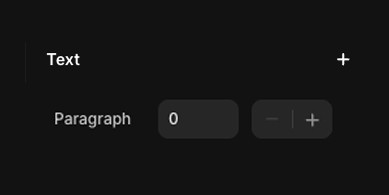
The the text under me is set to size 0 Pixels
The quick brown fox jumped over the lazy dog. It paused for a moment, tail twitching, then darted off into the tall grass. Behind it, the dog let out a sigh and rolled onto its side, unbothered.
The sun hung low in the sky, casting long shadows across the field.
Birds chirped in the distance, and a breeze rustled the leaves—just another quiet afternoon in the countryside.
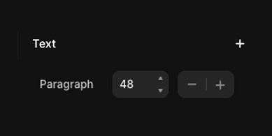
The the text under me is set to size 48 Pixels
The quick brown fox jumped over the lazy dog. It paused for a moment, tail twitching, then darted off into the tall grass. Behind it, the dog let out a sigh and rolled onto its side, unbothered.
The sun hung low in the sky, casting long shadows across the field.
Birds chirped in the distance, and a breeze rustled the leaves—just another quiet afternoon in the countryside.